Lumina Dental — a dental clinic that feels different.
A complete boutique dental-clinic website, designed and built end-to-end: a warm, calming brand, honest pricing, an intuitive service architecture, interactive before/after sliders, and a friction-free booking flow.
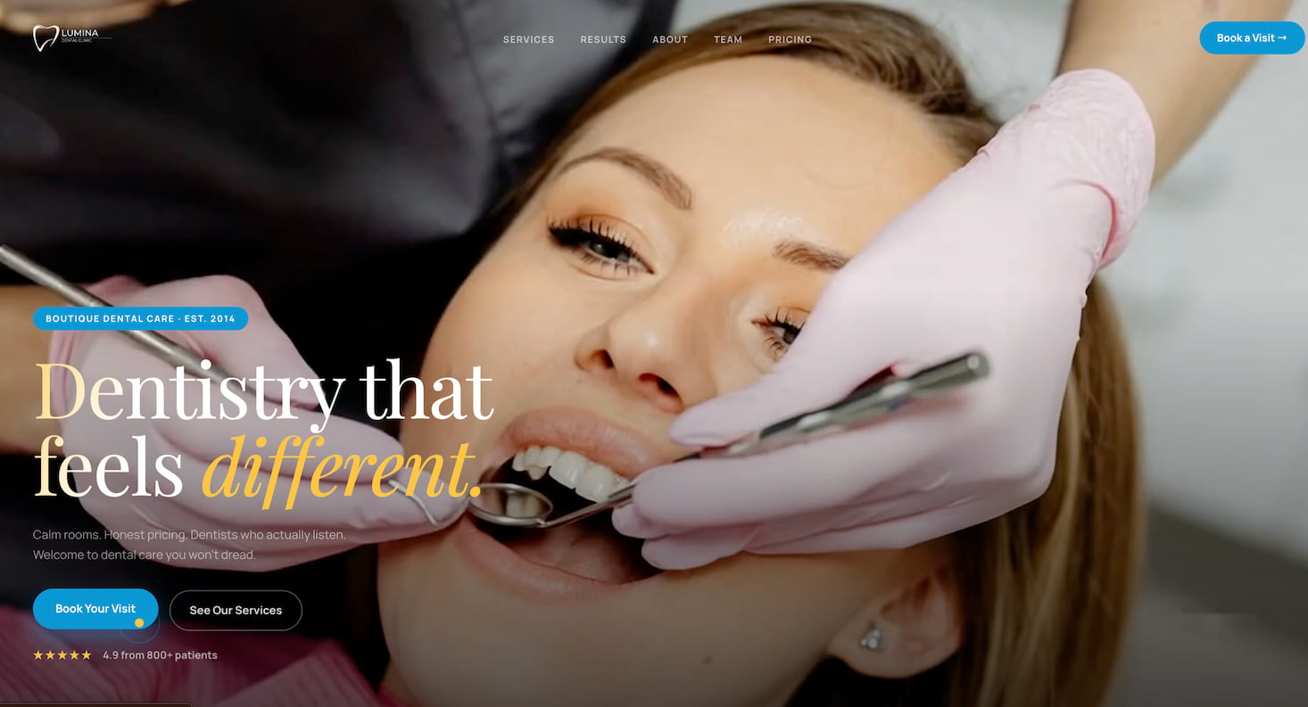
Make dental care feel calm, not clinical.
Most dental websites feel cold and corporate — stock smiles, hidden prices, and booking flows that make anxious patients bounce. The goal for Lumina was the opposite: a site that reassures before it sells, communicates honest pricing up front, and makes booking a visit feel effortless.
I designed and built the entire experience as a portfolio concept — from brand voice and typography to the responsive front-end and the booking form — to show how a small local practice can look premium and trustworthy online.
Project at a glance
- ClientLumina Dental (concept)
- IndustryHealthcare · Dental
- PagesSingle-page, 7 sections
- FocusTrust · Clarity · Booking
- BuildHand-coded, responsive
- Livedental-case.vercel.app
Every section earns its place.
Brand & identity
Warm cream palette, a friendly blue accent, and an editorial serif headline that makes the practice feel boutique rather than corporate.
Service architecture
Orthodontics, cosmetic, restoration and pediatric care organized into clear, scannable specialty sections with the right specialist attached.
Transparent pricing
An honest starting-price table — cleanings, whitening, Invisalign, implants — so patients know what to expect before they call.
Before/after sliders
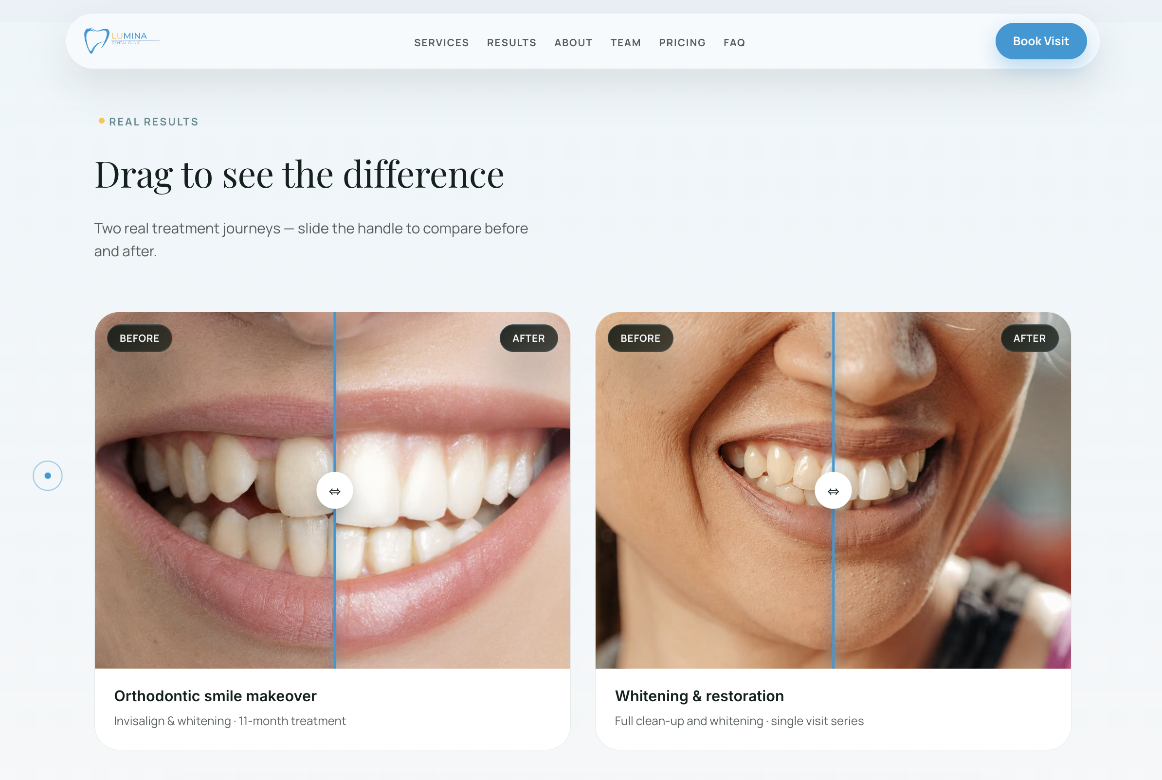
Interactive drag-to-reveal results that let real smile transformations sell the work better than any paragraph could.
Booking flow
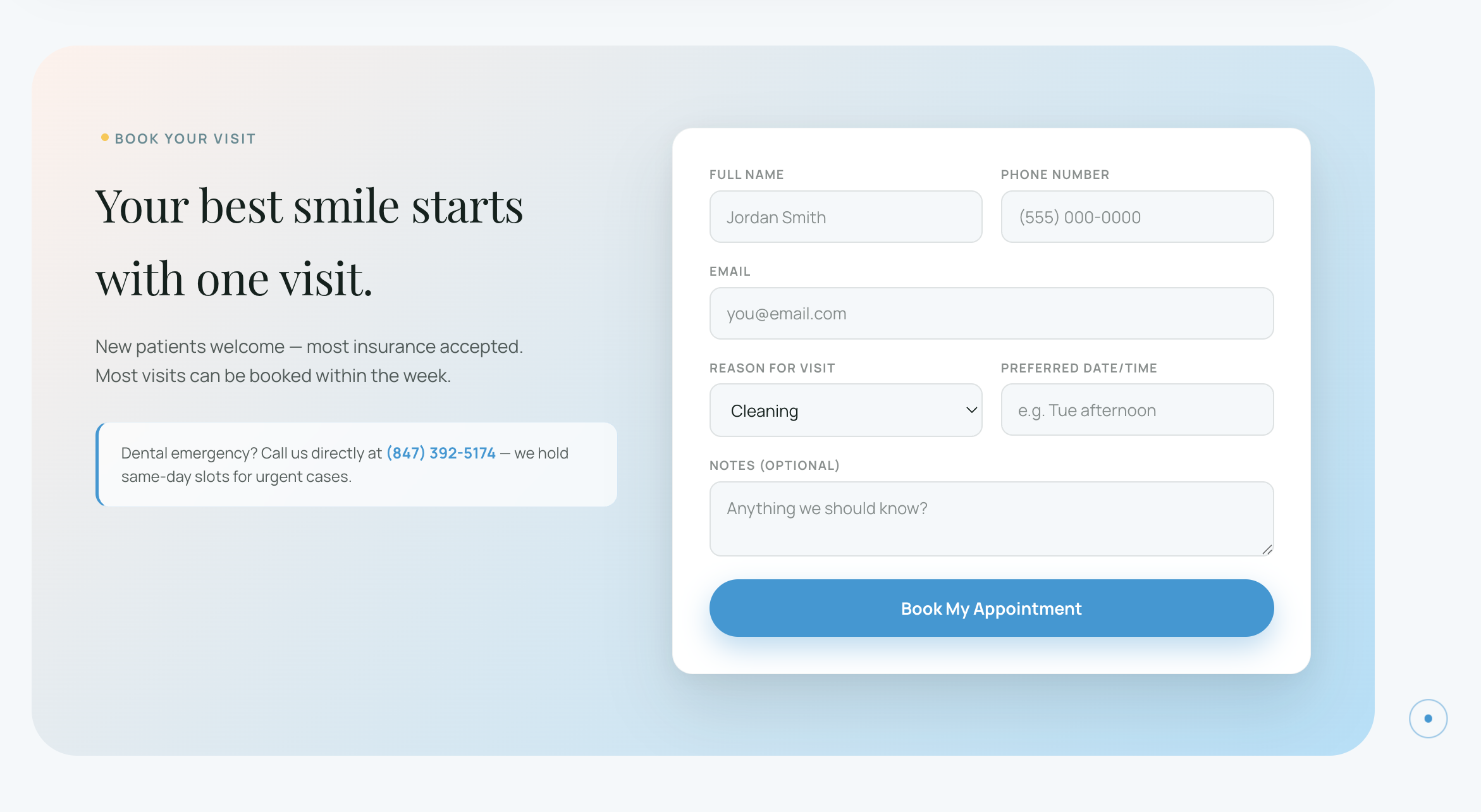
A simple, reassuring appointment form with 24-hour confirmation and insurance verification — designed to convert anxious visitors.
Responsive & fast
Hand-coded and fully responsive, so the experience feels just as calm and polished on a phone in the waiting room as on desktop.
Screens from the live build.
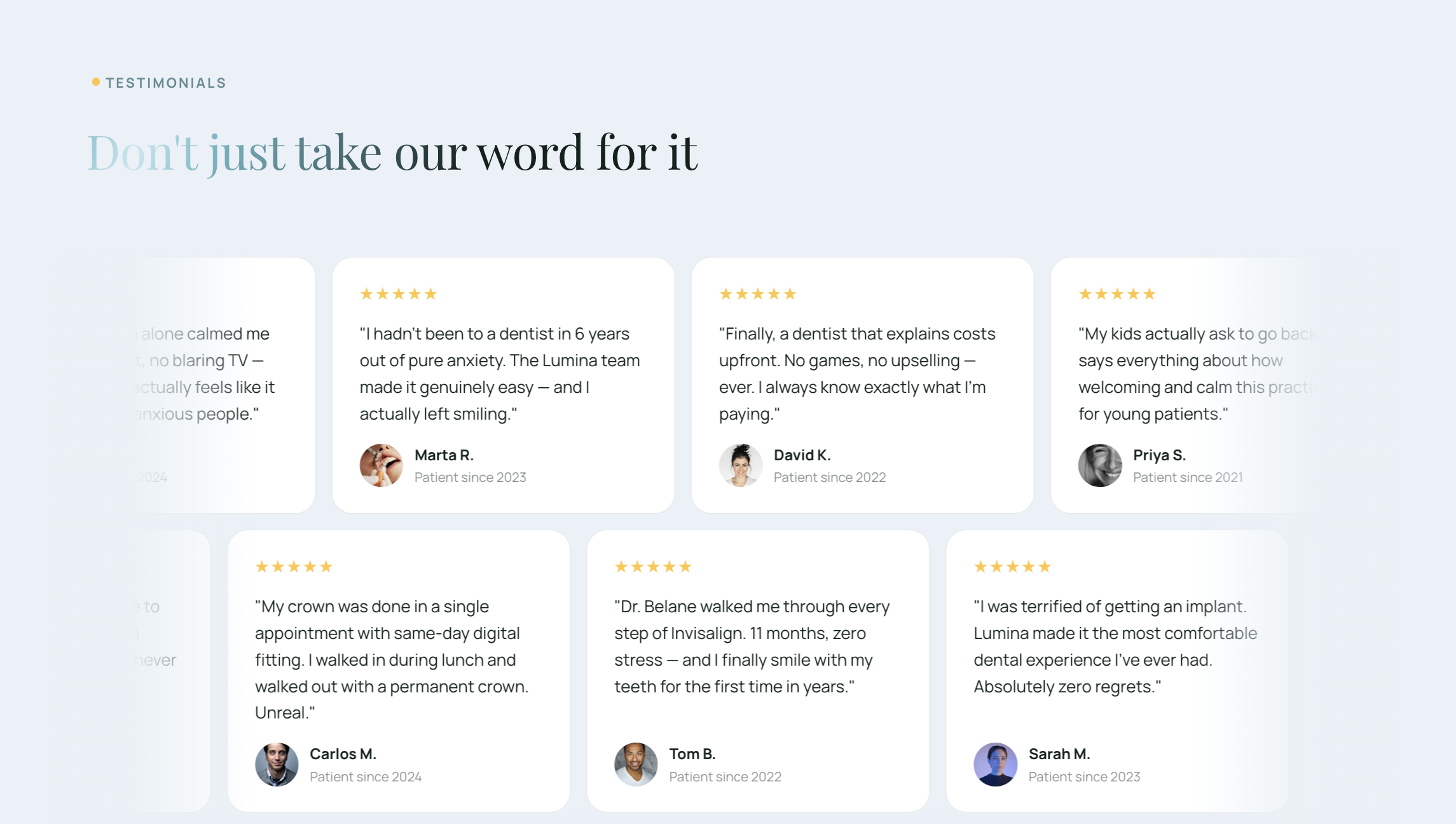
Captured from the live site — the calm dental pillars, the drag-to-compare before/after results, the friendly team section, and the honest, upfront pricing.
Designed to build trust at a glance.
These trust signals are built into the concept's design system to show how proof and credibility are woven through the page.
Built lean, built to last.
The whole site is hand-coded — no heavy page builders — which keeps it fast, easy to host anywhere, and simple to hand off. Clean semantic HTML, modern CSS, and a touch of vanilla JavaScript for the interactive sliders and mobile menu.
What this demonstrates
- DesignBrand & UI from scratch
- BuildFront-end development
- UXConversion-focused flow
- ContentCopywriting & structure
Want a site like this for your business?
This is the kind of website Lehko builds — clear, calm, and made to convert. Get an honest estimate before we ever talk.
Get My Instant Estimate →